Deal Flow Dashboard
Published Jan 4, 2025
/
Updated Jun 13, 2026
/
1 minute read
This Power BI dashboard turns sample deal-flow data into a pipeline view for sales and revenue conversations. It is designed to show where opportunities come from, how they move, and where attention is needed.
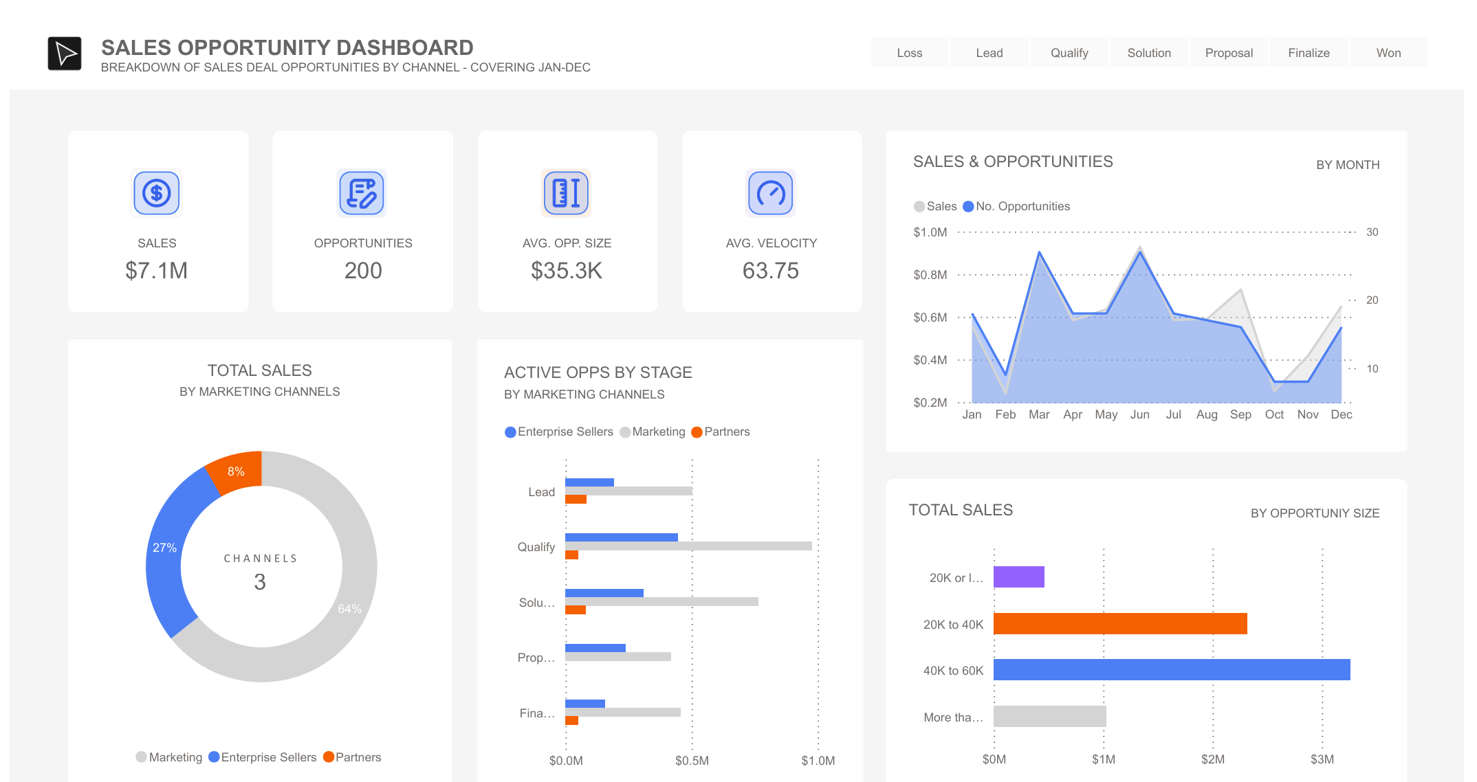
What's In The Dashboard
I included a few views to make the pipeline easy to scan:
- The Numbers: Headline measures include total sales, number of active deals, average deal size, and pipeline velocity.
- Sales Channels: A breakdown of where deals are coming from, including enterprise, marketing, and partner channels.
- Pipeline Stages: Shows how many deals sit in each stage, from initial leads through to closed deals.
- Monthly View: Plots sales and opportunities over time to make trend changes easier to spot.
- Deal Sizes: A simple deal-size breakdown helps show whether the pipeline is concentrated in larger opportunities or spread across smaller ones.
Professional Use
Although this uses sample data, the dashboard pattern maps to a common executive BI need: translating raw CRM data into a clear view of pipeline health, channel performance, and deal-stage friction.