Customer Analysis Dashboard
Published Jan 4, 2025
/
Updated Jun 13, 2026
/
1 minute read
I created this Power BI dashboard to analyse customer demographics and spending patterns using sample data. It demonstrates how a customer base can be segmented quickly for commercial analysis and decision support.
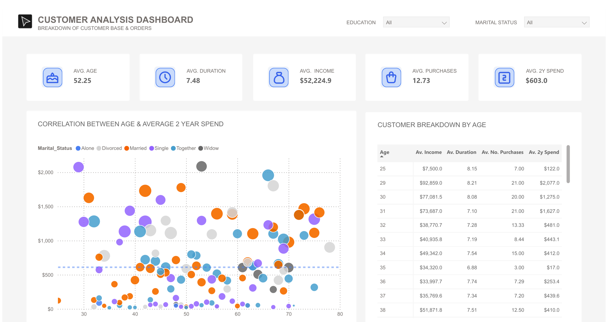
What's In The Dashboard
The dashboard breaks down customer data into several key views:
- Quick Stats: Key measures include average customer age, relationship duration, income, number of purchases, and two-year spend.
- Spending Patterns: The main scatter plot shows the relationship between customer age and two-year spending, with marital status used as a comparison layer.
- Customer Segments: A detailed breakdown table shows customer metrics by age, including average income, duration of relationship, number of purchases, and spending.
- Filtering Options: Education and marital-status filters make it easy to drill into specific customer segments.
Professional Use
Although this uses sample data, the dashboard pattern is directly applicable to customer analytics work: spotting valuable segments, comparing behavioural patterns, and giving stakeholders a fast read on where attention should go next.